Follow Us


© Copyright 2026 ArcTouch. All rights reserved.
© Copyright 2026 ArcTouch. All rights reserved.
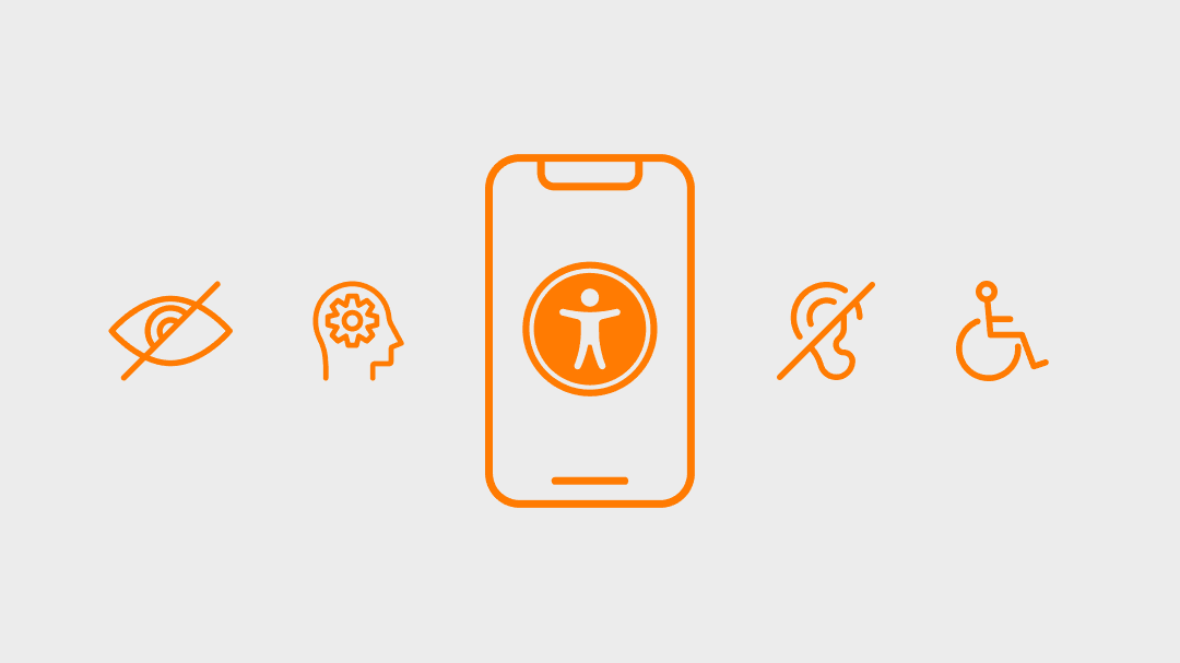
ArcTouch design leaders share best practices for accessible app design, and how they designed the Magellan Rx app for accessibility.
5 min. read - February 24, 2022
Get our newsletter in your inbox.
ArcTouch shares 7 accessibility user testing insights and best practices for apps and websites.
ArcTouch’s design team shares insights on using generative AI to help create mood boards for UI inspiration.
We help companies of all sizes build lovable apps, websites, and connected experiences.
When it comes to app design and development, accessibility isn’t just an add-on. It’s not a step in a project or a checklist feature. And it’s definitely not a line of code that you can drop in at the very end of a project. To create a truly accessible app, you need to design it to be accessible right from the start. Accessibility-First is a mindset that guides you through every phase of the app development process.
And, with the full support of our client Magellan Health, that’s exactly the mindset we had when we designed and developed the new Magellan Rx app.
It’s commonplace for development teams to stall on creating accessibility experiences from the very beginning of a project. They may think building an accessible app will be too expensive or take too much time — and so they may make the decision to add accessibility to their future roadmap, after the initial launch.
True, there’s no denying that building an accessible app requires some extra time/cost from design and development teams. However, it’s more complicated (and expensive) to try to make an existing app accessible rather than doing it from the very beginning.
And virtually everyone can benefit from accessibility features and best practices.
There was never a question about whether or not to make the Magellan Rx app accessible. As a leader in healthcare, Magellan Health believes it is critical to provide the best possible experience for all its members.
So, accessibility was a “must-have” from the early design phase through the release of the Minimum Lovable Product (MLP).
Here are the seven best practices we followed during our accessibility-first app design process for the Magellan Rx project:
From the very start, we used accessible app design and development principles as the foundation for every decision throughout the project. Accessibility weighed in each discussion just like other common design pillars — such as experience patterns and usability heuristics. Accessibility also streamlined our decision-making by helping us rule out ideas that wouldn’t work in an accessible app.
For example, during ideation, we considered using buttons with weather-associated emojis to ask users how they were feeling. We had a rainbow for “feeling great” and a thunderstorm for “feeling bad.” It seemed like a clever idea at first, but there’s a problem: people with cognitive disabilities/conditions (such as Autism Spectrum Disorder) may have difficulty understanding metaphors and analogies. Therefore, using weather metaphors to ask people how they’re feeling is not an accessible idea — so we abandoned the idea. It would be better to say “good” or “bad.” Or, since we really wanted to use emojis, we chose two that were more directly related to the question — simple smiley and sad emojis, as seen right below.
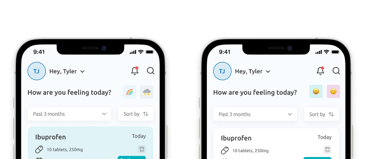
The screen on the left uses weather emojis to ask people how they’re feeling, and the screen on the right shows a better accessible design approach, with smiley faces.
Color contrast is simple yet very important when it comes to designing for accessibility. We worked closely with Magellan’s branding team to implement the company’s key brand elements. Magellan has a colorful brand palette, but we had to avoid some color combinations (like yellow background with white text) to make sure there was enough color contrast. Magellan’s branding people were truly great partners in this process, as we worked together to balance the brand’s defined styles with accessibility constraints.
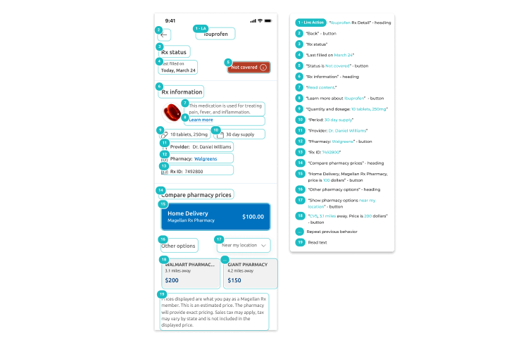
In the same way that ensuring good color contrast is an accessibility must-have, not using color as the only way to convey information is crucial. Color blindness is a common condition, so relying on color codes is not an inclusive practice. With the Magellan Rx app, we use color as one of the ways to distinguish the status of different orders and medications — however, we combine color with a text label.
Using simple-to-understand, descriptive copy on buttons is not only a good accessibility practice but also a good UX practice. Everyone can benefit from clearly written text on buttons — especially those who navigate using screen readers. We have some screens in the Magellan Rx app that originally had two (or more) buttons using the same label. One example is the Contact Us screen, where we added buttons so that users could copy the phone number or email address to the clipboard. In the initial mock-ups, we labeled both buttons with “Copy” because a shorter label is better to avoid breaking the button into two lines on smaller devices. However, the identical description for multiple buttons on the same screen causes a different (and major) UX problem — especially for screen readers. The solution was to make labels more descriptive and fully label them with the specific functionality “Copy email address” and “Copy phone number:”
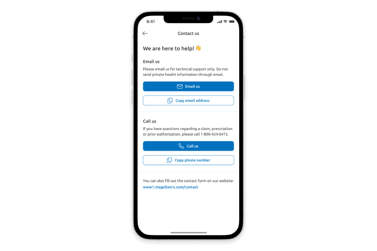
The “Copy email address” and “Copy phone number” features could easily be confusing if a simpler label such as “Copy” were used instead.
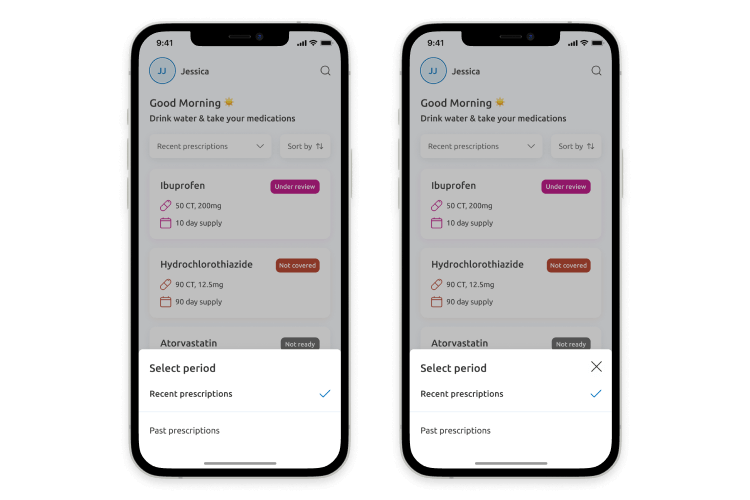
Every device now has a “Dynamic Type” feature that allows users to adjust the size of textual content displayed on the screen. Usually, it ranges from somewhat smaller than the default size to more than 200% larger text size. As product designers, we have to keep font scaling in mind while designing each individual screen. The risk of having a broken design when a user interface includes three or more columns is high. Considering this, we limited all screens within the Magellan Rx app to one or two columns. In some cases, we also defined a specific component behavior for when the user increases the device’s font size.
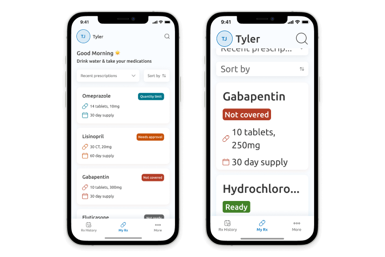
An example from the Magellan Rx app of default font size vs 200% font size.
Screen readers provide an audio description of all elements on a screen, so users can navigate just by listening. Just like font scaling, pretty much every device has a native screen reader. The most popular ones for mobile devices are VoiceOver (for iOS) and Talkback (for Android). App designers and developers must make sure that every app is compatible with the screen reader technology. As product designers, our role is to define how the screen components should be read and in which order. There are different experience patterns for screen readers — for example, the way that a button is read is different than the way a tab bar is read, which is different than the way a text input is read. For all screens, we provided screen reader annotations as part of our standard design deliverables for the development team.
We included voice-over annotations for screen readers in the accessible design deliverables to the app development team.
In some screens, we had components with actions that didn’t rely on a specific button: for example, an action that could be dismissed if you tap outside the active component area. For a user who’s having a visual experience, this kind of pattern is pretty intuitive. But to a person navigating by listening, it’s more intuitive if they can take action by tapping a specific button instead of a non-described action. To solve this problem, we displayed extra UI components for some screens only when the screen reader is turned on.
For those with an active screen reader (right), we display a close button (X) in the bottom component so that the user can choose to close it — instead of tapping outside the component area, which could not easily be explained by a screen reader.
Last but not least, it’s important to remember that every app needs to be maintained and improved over its lifecycle if you hope to transform your idea into a truly successful app. Delivering an accessible app doesn’t end when you publish the app. With each new release, you must continue to have a mindset that focuses on accessibility. Fortunately, when accessibility principles are part of an app’s design foundation and design system, maintaining that accessibility over the app’s lifecycle becomes much easier.
To make an accessible app, you may have a bigger design effort in the beginning. However, defining an accessible app from the start makes it easier to create and maintain a lovable app experience for everyone.
This covers some of the best practices for designing accessible apps. To learn more tips and best practices for your whole product team, download our free app accessibility checklist.
ArcTouch has been creating lovable apps for companies of all sizes since the dawn of the App Store. Let’s build something awesome together! Contact us to get started.
