Follow Us


© Copyright 2026 ArcTouch. All rights reserved.
© Copyright 2026 ArcTouch. All rights reserved.
ArcTouch shares 7 accessibility user testing insights and best practices for apps and websites.
8 min. read - May 22, 2024
Get our newsletter in your inbox.
ArcTouch’s design team shares insights on using generative AI to help create mood boards for UI inspiration.

The Figma variables tool can streamline UX/UI design systems and ensure alignment across a product design team.
We help companies of all sizes build lovable apps, websites, and connected experiences.
User testing is a key part of any digital product design and development process. And when it comes to building accessible products, it’s essential. Why? Many users rely on accessibility features — and without them, they’d simply be unable to use digital technology. To get a sense of how many people can benefit from more accessible apps and websites, read our post about accessibility-first app development. It’s way more than you think.
So, while user testing is always a best practice, it’s especially important to test accessibility features with those that depend on them. (For more best practices about building accessible apps, download our free app accessibility checklist.)
Our app accessibility experts recommend Fable, an accessibility testing platform to test working products and design concepts with disabled users. In this post, we share seven insights and actionable best practices we’ve learned from using Fable to test apps and websites.
Screen magnification empowers users with visual impairments to enlarge content. However, poorly implemented designs can hinder navigation and content discovery when using screen magnification. During recent disabled user testing of our upcoming new ArcTouch website, participants who used screen magnification had trouble locating navigation elements and main menu items in the wireframe. This was primarily due to the lack of visual cues indicating the presence of additional content beyond the immediately visible area. It wasn’t clear that scrolling or further exploration was necessary.
One tester emphasized the need for improved visual cues to enhance content discoverability. They suggested using “color contrast and more visual cues like borders around tiles” to make elements more easily identifiable, even when zoomed in.
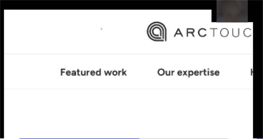
In this session, you can see that our wireframe did not use any visual cues to make the selectable fields identifiable:
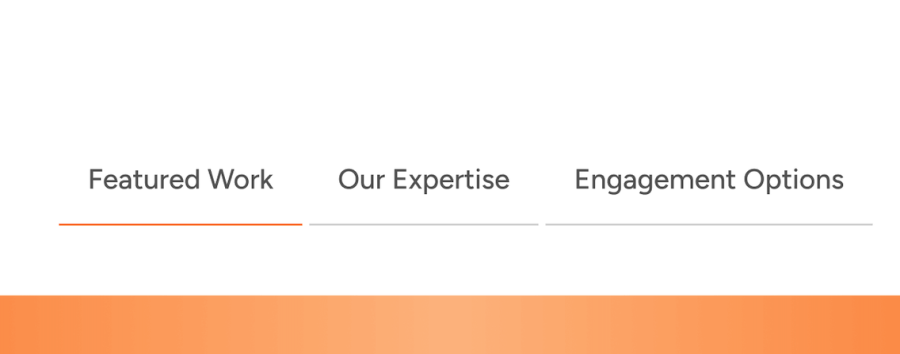
Our final prototype better defines elements, so users can see the selected tab (underlined), along with the orange section that indicates more content below:
Make it responsive. Prioritize responsive design principles so content displays properly across various screen sizes and resolutions.
Define elements with borders or other visual separators (e.g., arrows or partially visible elements).
Use consistent navigation patterns and predictable element placement.
Negative space, also known as white space, is crucial for enhancing accessibility for users who rely on assistive technologies. By providing ample space between elements, negative space offers numerous benefits, such as:
Accommodation for assistive technology UI: Negative space creates room for user interfaces added by assistive technologies (e.g. screen reader cursors and voice control menus) without disrupting the page layout or causing visual clutter.
Improved navigation: Negative space ensures a clear separation between elements for users navigating with keyboard shortcuts, grid navigation, or numbers navigation. This prevents confusion, making it easier to identify and interact with the desired content.
Enhanced focus: Negative space helps users focus on the core content by reducing visual distractions and cognitive overload. This is particularly beneficial for users with cognitive or visual disabilities.
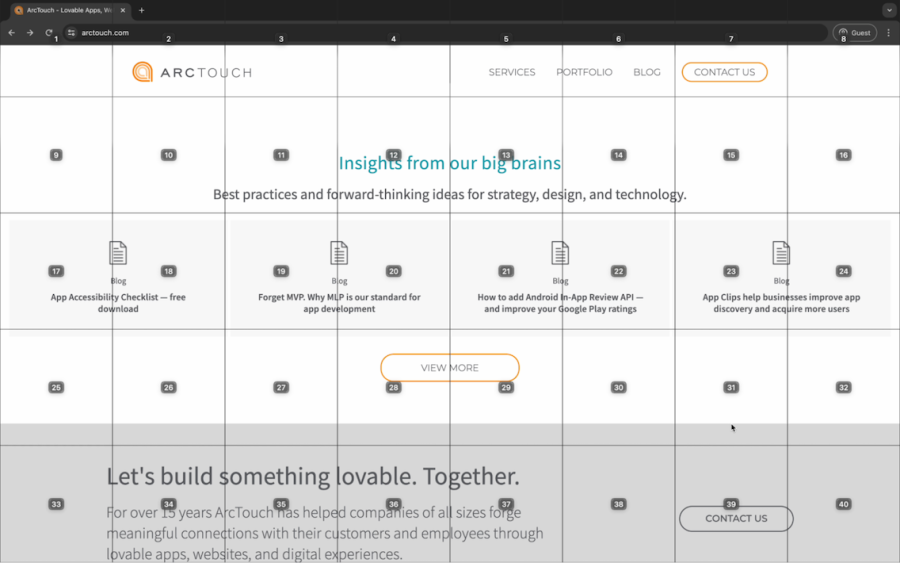
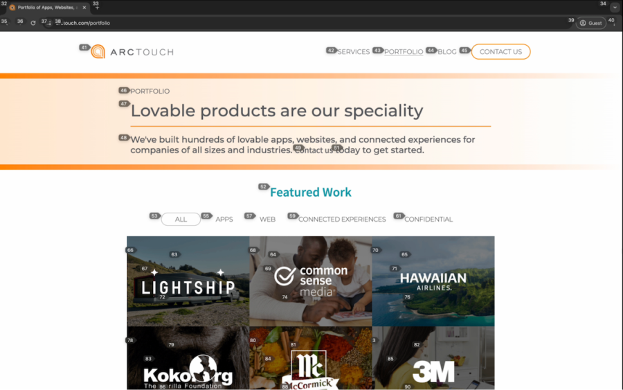
During a user testing session, we observed a participant use grid navigation and numbers navigation to browse links on a website.
Grid navigation, shown above, uses a grid pattern to facilitate user movement between page elements.
Numbers navigation is an accessibility feature that allows users to quickly jump to different sections of a webpage. This is particularly beneficial for users with motor impairments.
Use ample negative space (white space) around elements to optimize user interfaces for assistive technologies.
Implement consistent margins, padding, and spacing between interactive elements to prevent misclicks and enhance clarity.
Use a minimum touch target size of 44×44 pixels for touch interfaces, as recommended by WCAG for websites. Android’s Material UI guidelines recommend a target size of at least 48×48 pixels. While Apple’s Human Interface Guidelines recommend a target size of at least 44×44 pixels.
Use line spacing of at least 1.5 times the font size to improve readability.
Although clean and simple interfaces with white backgrounds are often admired for their clarity, they may cause problems for users with low vision or sensitivity to light. The brightness can cause eye strain, fatigue, and headaches, making it tough for users to interact with digital content.
During user testing, we witnessed the negative impact of bright white backgrounds. One visually impaired participant described the experience as “like looking at the sun,” highlighting the discomfort it caused.
To address this issue, providing a dark mode option is crucial for accessible apps and websites. Dark mode inverts the color scheme, using a darker background with lighter text. This significantly reduces the screen’s brightness, alleviating eye strain and improving comfort for light-sensitive users.
As one of our user testers explained, dark mode can even reduce the need for screen magnification tools. The enhanced contrast and reduced glare make content easier to perceive, allowing users to comfortably navigate at standard magnification levels.
Implement both a light and dark mode to give users the choice to adjust screen brightness and improve content visibility.
Offer sufficient color contrast between text and background.
Crafting effective UI labels presents a unique challenge in user experience design, requiring a balance between clarity and conciseness to cater to diverse user needs.
In a recent accessibility testing session, the user confirmed that overly brief labels like “more” don’t offer enough context. This ambiguity can leave users uncertain about the action’s outcome or the content they’ll encounter.
While adding hints or using more descriptive labels might seem like solutions, adding too much information introduces other challenges. Hints can be disabled by users in the OS settings. Meanwhile, longer labels can pose difficulties for screen magnification users or those who rely on alternative navigation methods.
Prioritize contextual clarity. When writing labels, aim for brevity while still maintaining clarity.
Use simple and commonly understood language. Avoid jargon or unnecessary words.
Use accessibility hints with discretion. Use only when there is no way to make labels self-explanatory.
Apply tooltips and hover states to provide additional information without cluttering the main label. These can reveal further details on demand, enhancing clarity without impacting the core label’s conciseness.
Implement informational modals to allow users to get more information when an element may need more explanation than the interface affords.
Conduct regular user testing, including with those using assistive technologies. Gather feedback on label clarity and conciseness to make iterative improvements for optimal accessibility and usability.
Like labels, writing effective alt-text is a balancing act. It requires clear descriptions and brevity to optimize the experience for screen reader users.
User testing consistently reveals the positive impact of well-written alt text. Descriptive and helpful alt text is often one of the first elements screen reader users encounter, significantly shaping their initial understanding and overall experience.
However, a challenge arises when dealing with multiple images or complex visual elements. Overly long alt-text descriptions can become cumbersome and time-consuming for screen reader users to navigate. As one tester recently highlighted, lengthy descriptions for non-essential elements are frustrating and hinder their ability to efficiently find the information they want.
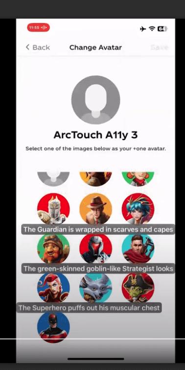
Here you can see that the label descriptions for the on-screen avatars overlap one another:
Identify the function of the image. Is it purely decorative, or does it convey essential information (e.g., product photos, charts, and diagrams)?
Analyze the image’s content in relation to the surrounding text or interface elements. Is the same meaning conveyed to all users?
Small target areas within user interfaces pose significant accessibility barriers for individuals with fine motor control disabilities. They may experience difficulty precisely targeting small areas, resulting in unintended clicks or taps and increased frustration with an app or website. Repeated challenges in interacting with small targets can cause users to abandon tasks or leave the application altogether.
One participant of a recent accessibility user testing session uses head movements for cursor control. They shared their experience with websites: “When I was first learning to use my head, I wasn’t very precise… it would have been helpful to have a big clickable area.”
This user further highlighted the added challenges faced in public or shared office environments (e.g. a desk that shakes when coworkers walk by). “Sometimes my cursor can be a bit jumpy, and it’s a lot harder to click in a (small) area.”
Provide ample spacing between interactive elements to prevent accidental clicks or taps and enhance clarity. For optimal usability and accessibility, maintain a minimum spacing of 8 pts between interactive elements on iOS, 8 dps on Android, and 8 px on Web platforms.
Group elements together that share a single action to create a larger target (e.g., a card component where the entire area should be selectable rather than just the card title).
Clear and consistent feedback is crucial for providing a smooth user experience, especially for those who use screen magnification to navigate digital interfaces. During a recent accessibility test, a user who relies on screen magnification pointed out a common issue: A user pressed next (as shown below) on a button, but the magnified screen didn’t show the action that the button activated, and the next button itself did not provide visual feedback. This lack of feedback can cause frustration and uncertainty and lead to users abandoning tasks.

Use apparent visual cues to indicate button states like hover, active, and pressed. Ensure changes in states are noticeable even when using screen magnification.
Incorporate subtle yet clear audio cues (e.g. clicks) for confirmation, and provide options for users to customize or disable these.
Enable haptic feedback (vibration) for tactile confirmation (if supported by the device). This provides an additional layer of input beyond visual and audio cues.
For more than 15 years, ArcTouch has helped companies create lovable apps and websites. Whether you’re building a new product or want to improve the accessibility of an existing one, our accessibility experts can help. Contact us today for a free consultation.
