Follow Us


© Copyright 2026 ArcTouch. All rights reserved.
© Copyright 2026 ArcTouch. All rights reserved.
How ArcTouch created a reusable design system foundation to jumpstart client projects, keep product teams aligned, and maintain consistent user experiences
4 min. read - June 9, 2026
Get our newsletter in your inbox.

A comprehensive set of standards, documentation, and reusable components help make the company’s new website more accessible

The Figma variables tool can streamline UX/UI design systems and ensure alignment across a product design team.
We help companies of all sizes build lovable apps, websites, and connected experiences.
When a new digital product kicks off, teams usually focus on features, roadmaps, and scope. But a lesser-discussed issue may have a big impact on your time to market: whether you're starting from a blank canvas or building on a proven foundation in the form of a design system.
ArcTouch created Arcadia to eliminate the "blank canvas" problem. It is the reusable design system framework our product designers use to rapidly spin up a custom, scalable design system for each client.
By using the core architecture we built in Arcadia, we no longer have the repetitive work of building UI primitives from scratch. This allows us to deliver a fully branded, accessible, and documented design system — offering a months-long head start on projects.
Most product teams face similar challenges: the pressure to ship faster, the struggle to maintain consistency across platforms, and the need to integrate AI into their workflows. A design system helps solve these at scale, but building one from scratch is a significant investment that many companies struggle to justify or execute.
Arcadia is a ready-to-use design system we provide to our clients at no cost. It’s based on the best practices and modern design principles we’ve perfected over hundreds of projects. For our clients, the benefits of using Arcadia are numerous:
Speed to market: Building a product usually requires defining basic patterns for components and responsive layouts. Arcadia eliminates this repetitive work. By using our design system framework as the engine, we can help you move from initial workshops to branded, high-fidelity UI in just a matter of days.
Digital accessibility as a default, not an afterthought: Accessibility is often a late-project fix that causes delays. With Arcadia, digital accessibility standards like WCAG 2.2 are baked into the core components. Designers and engineers see requirements — like focus states and screen reader support — the moment they begin, ensuring the product is inclusive from day one.
A structured foundation for AI: Modern AI tools work best with highly structured data. Arcadia’s tokens and components use standardized naming and organization, so AI tools like Claude can quickly generate usable screens that follow your specific patterns rather than making generic guesses
See how 50 leading Android and iOS apps across five industries performed when evaluated for digital accessibility.
Download our new book Human + AI: The new way to build apps that are lovable.
Here is how we organized and built the Arcadia design system to ensure it stays scalable, easy to update, and responsive.
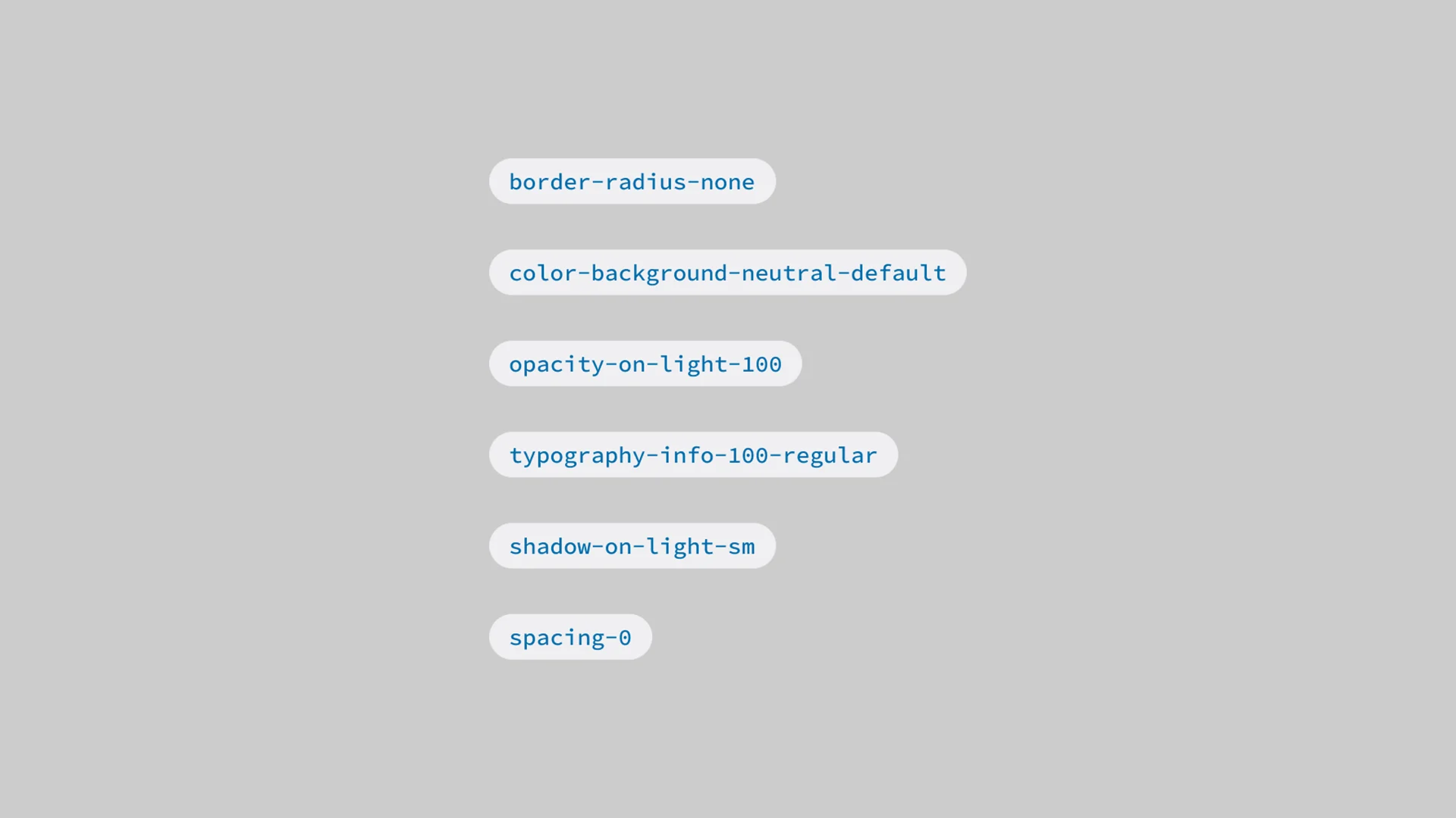
Naming may seem minor, but it is essential for scalability. We planned our naming structure so it makes sense to both designers and developers. We use just over 100 semantic tokens to classify and organize variables. This simplified structure supports multiple themes, enables responsive behavior, and even simulates font scaling up to 200% out of the box.
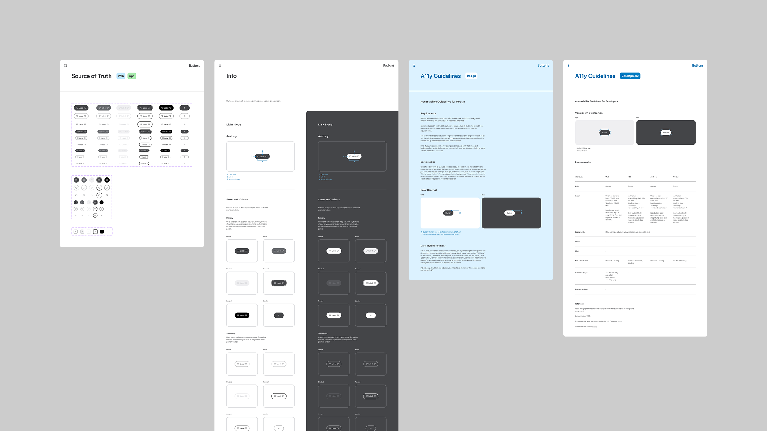
Design documentation shouldn't be a chore for teams; it should be a record that allows any new team member to find answers without a long onboarding process. We organized Arcadia using Atomic Design principles. Within the file, every component includes:
The source of truth: Clear guidance on usage.
Anatomy and behavior: Details on how the component moves and reacts.
Accessibility notes: Specific instructions for both design and development teams.
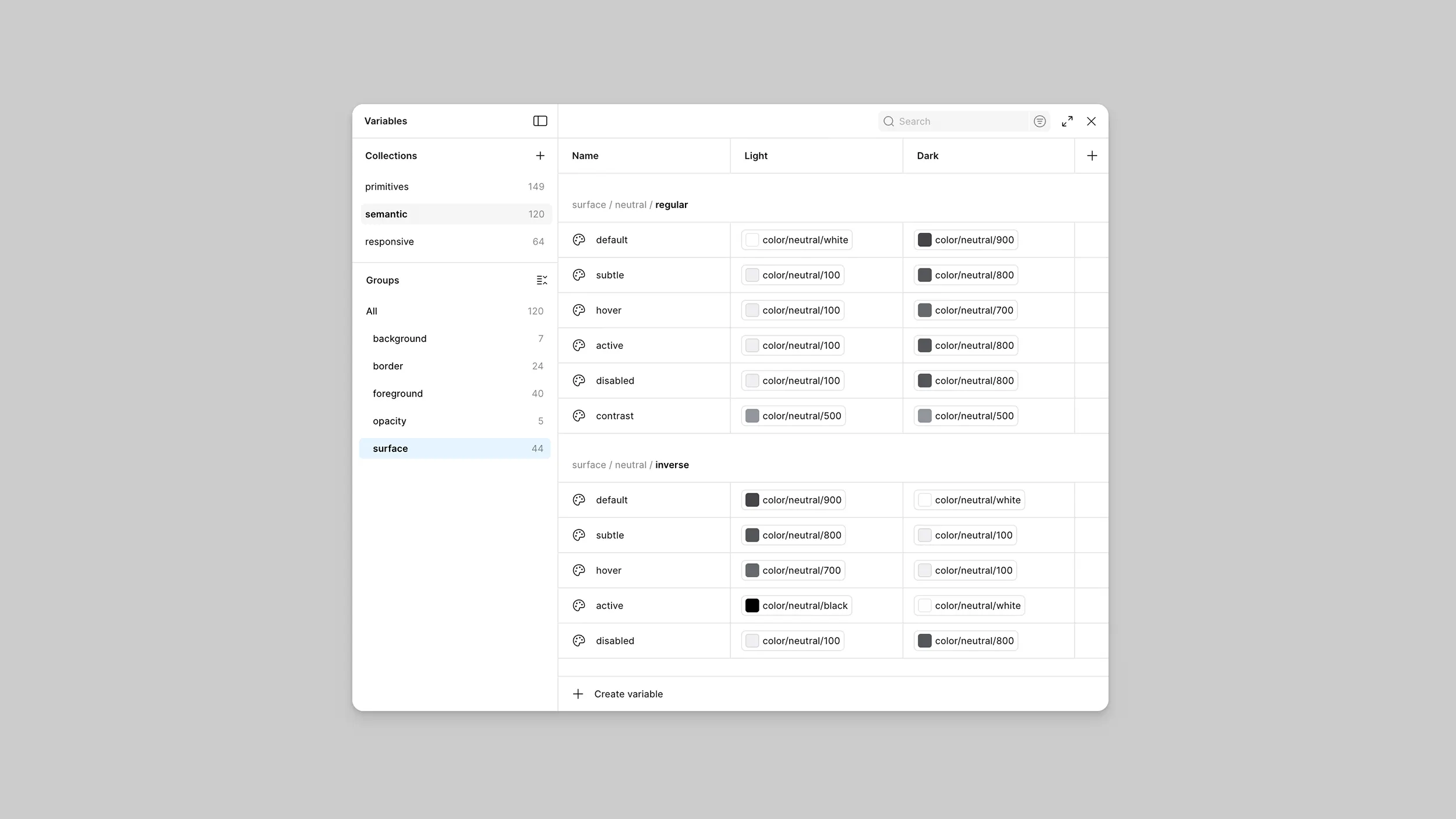
Naming standardization was the foundation for our variables. Once names were defined, we classified and organized them using just over 100 semantic tokens. This simplified, scalable structure does more than just organize colors; it supports multiple themes, enables responsive behavior, and even simulates font scaling up to 200% to ensure accessibility is baked into the logic.
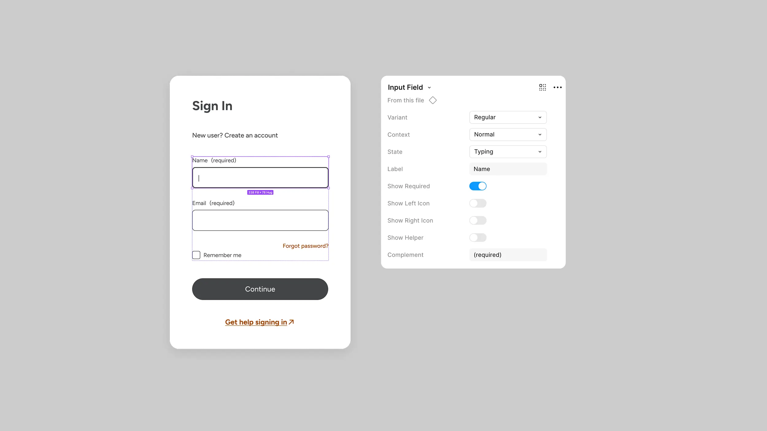
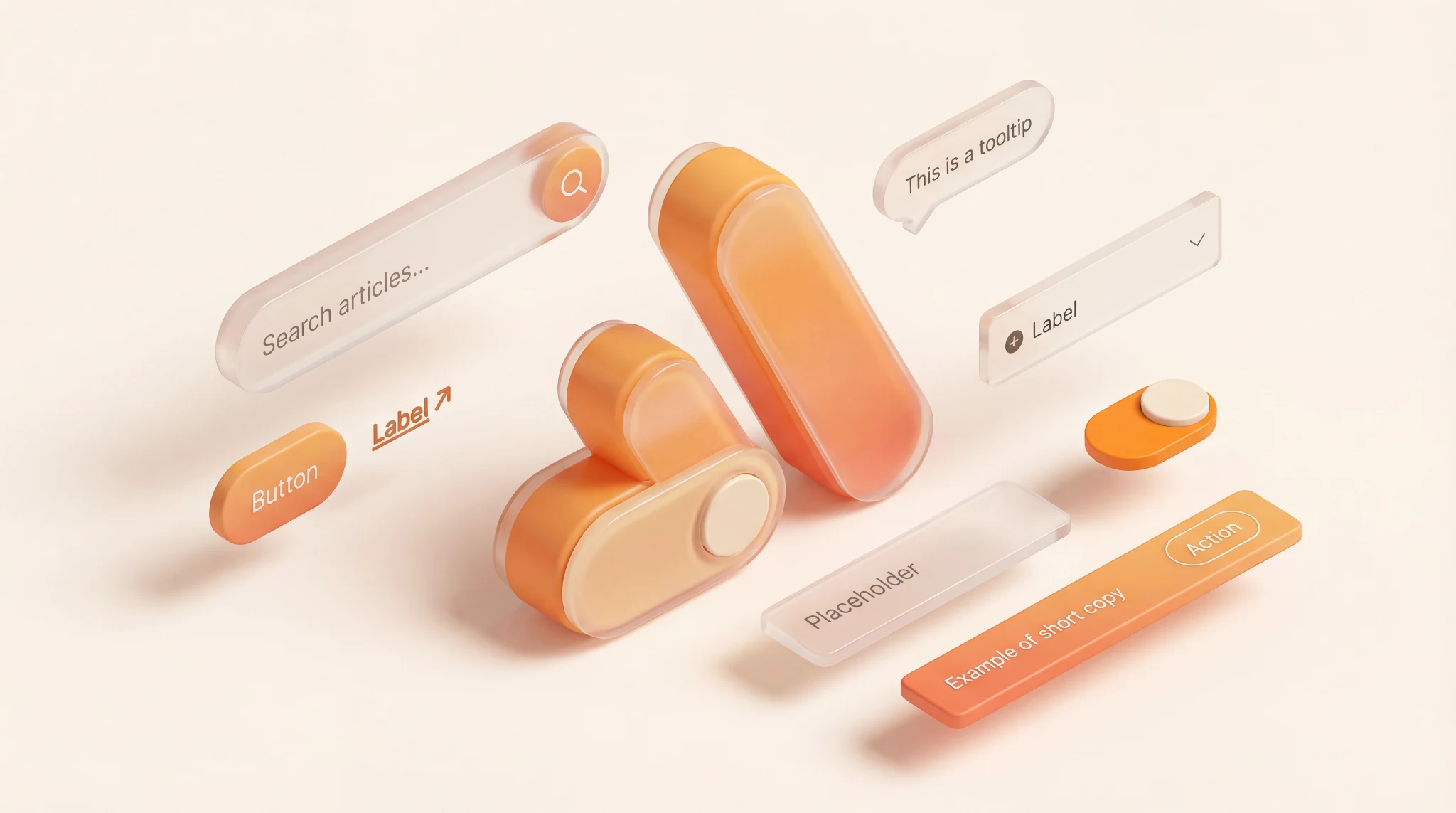
Every component in Arcadia is designed to be complete yet quick to configure. For example, with the Button component, we analyzed every possible variable — sizes, states, icons, outlines, and themes — and built a single "smart" component. Instead of rebuilding a button for every case, a designer simply toggles the properties they need. The goal is to make the right choice easy and the inconsistent choice harder.
Our clients build across platforms, so Arcadia does too. Every component was built in code to support app and web platforms. This reduces the "drift" between design intent and implementation, ensuring a cohesive experience regardless of the device.
Most organizations already have brand guidelines with defined logos, colors, and fonts. Think of these as a cookbook: They tell you what the final dishes should look like and which ingredients to use.
But a cookbook doesn't cook the meal. For that, you need a kitchen.
Arcadia is our professional kitchen. While a design system is the organized environment — stocked with labeled ingredients, prep stations, and standardized recipes — Arcadia is the underlying infrastructure that allows us to set up that kitchen in days instead of weeks.
With the professional kitchen already built and optimized, our team can focus entirely on the cooking: crafting the unique customer journeys and features that actually drive impact for your business.
While Arcadia is the foundation we use to build, the result is a fully realized design system for your internal teams to manage and scale long after the initial launch.
Get in touch with us to see how ArcTouch leverages our Arcadia design system to launch products faster, use client budgets more efficiently, and deliver more lovable user experiences.
