Follow Us


© Copyright 2026 ArcTouch. All rights reserved.
© Copyright 2026 ArcTouch. All rights reserved.
Many apps have outdated features and badly need a UX overhaul. Our team of top app developers share 15 signs your app needs a reboot.
5 min. read - June 16, 2021
Get our newsletter in your inbox.

ArcTouch’s app developers explore how a smarter Siri can lead to new and improved app experiences
Learn how Dynamic Island can help iOS app developers and brands increase their app user engagement.
We help companies of all sizes build lovable apps, websites, and connected experiences.

We believe apps are either lovable or, well… not lovable.
We always aim to build the former. In our blog post about building a Minimum Lovable Product, we explain how to create something useful and delightful to use.
Often that means ensuring your app is leveraging the latest technologies from Apple and Google — and following the best practices in user experience (UX) and interface design.
And for any existing app, it means keeping your app modern and updating it regularly.
Many companies have taken a ship-it-and-forget-it mentality — resulting in a digital dinosaur. There are business consequences for allowing these relic apps to collect virtual dust in the App Store. Your UX might just be so irritating that your app rating is plummeting, and bad reviews are piling up. And, you’re losing customers. And, no one is finding your app anymore because it isn’t showing up with other leading apps. And, by doing nothing, you’re handing over users to your more digitally sophisticated competitors. And, oh, by the way, you may be close to getting an app store eviction notice from Apple or Google for failing to stay up to date with the latest OS standards. And that may usher your app to the graveyard. Without any memorial service! ?
We thought it might be helpful to share some of the clear signs that your app is out of date and needs a reboot.
We separated these into two groups. The first includes crucial UX issues you need to address for the sake of your current users. (Stop irritating them!)
The second represents missed opportunities — things that you really should do to help your app’s long-term growth and health.
These misses fail on some of the most basic elements and best practices for modern lovable apps. Without them, you have more SUX than delightful UX.
Many of these issues cause unnecessary friction in the app experience. For example, your app may lack support for tools that make e-commerce easy or simplify the sign-in process. Or it might be a primary UI function that causes your app (and business) to lose credibility with users. In any case, at ArcTouch, we never want to ship an app that makes these mistakes.
Many people prefer the dark mode UI in Android and iOS — either all the time or at night. I’m one of them. But nothing wrecks that soothing, sleek experience more than a bright-white app encased in native dark-mode elements. If your app doesn’t support dark mode, you need to step out of the dark ages.
Our eyes and our reading preferences are unique to each of us, making it essential for apps to support text scaling options, so users can easily change the size of the type within an app. And it’s not just about preference — font scaling is part of the accessibility guidelines for iOS and Android.
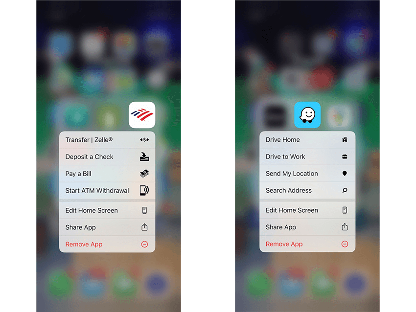
Example of “long press” on the Bank of America (left) and Waze (right) apps.
The long-press (iOS) and touch-and-hold (Android) gestures surface some of the most frequent and useful tasks in an app. They allow users to take action immediately. Many apps fail to take advantage of this gesture — and miss an opportunity to improve the user experience. Any feature that makes taking action faster and easier is a feature worth supporting.
In the early days of mobile apps, e-commerce companies often integrated their existing web-based stores within their mobile application. At the time, it may have made sense from a cost or time-to-market standpoint — but no longer. A surprising number of e-commerce apps still use a web store. From unnecessary extra navigational elements to additional account sign-in to a lack of native wallet support, the UX and UI are so poor — especially when compared to a sleek native e-commerce experience.
Though it ultimately hurts my wallet, the Apple Pay experience makes spending money so easy. When apps support it, the checkout process is effortless. And when they don’t, it’s frustrating and adds friction to the transaction. And this friction adds up. Some estimates are that businesses lose as much as 147 billion dollars during checkout from poor UX. There’s simply no excuse for apps not supporting digital wallets like Apple Pay and Google Pay.
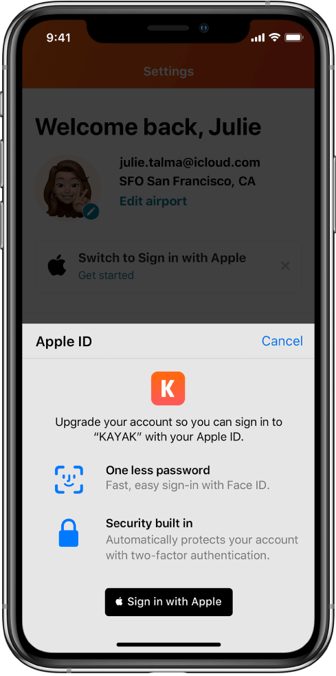
Example of Sign In with Apple.
Speaking of friction, another common usability pain point is the sign-up (and sign-in) process for many apps that require accounts. Typing usernames and passwords — along with any other signup info you may need — on a phone keyboard can be excruciating. It’s also a personal security risk, as users need to create and remember yet another secure password. Asking people to stop and create an account during their first launch experience (also known as “onboarding”) is very poor UX. A simple way to make this easier for users is to leverage Sign In with Apple and Sign In with Google. Once users have enabled these on their devices, the process of signing up or signing in to an account is effortless. For developers, it’s easy to support, too. See our post about how to implement Sign In with Apple.
Tackling a similar problem as SSO solves, apps that support biometric authentication — face or fingerprint recognition — make signing into apps much easier. I use Apple’s FaceID whenever possible and get annoyed when apps fail to support it. On the Android side, we’ve written about the relatively simple process of supporting fingerprint authentication in your Google Play app.
Although modern apps should use the SSO methods mentioned above, some apps will continue to use their own username and password authentication. Those apps can make signing in easier for their users by supporting password managers. Apps that use the iOS Password AutoFill framework can automatically fill username and password fields in their sign-in screen from popular password managers. Similarly, the Android Autofill Framework makes it easy to support password managers.
An increasing number of apps require two-factor authentication for logging in. You probably know the experience: You get an SMS message with a unique code and enter the code into the app. This is great for protecting sensitive information — however, it too can cause friction. One way to solve this is to support autofill via the messages/SMS app. Both Apple and Google support this through password autofill on iOS and automatic SMS verification on Android.
Although these may not be UX missteps, they are missed opportunities to attract more users and create greater levels of engagement.
App Clips (iOS) and Instant Apps (Android) are great ways for users to “try before you buy.” In other words, you can help bring new users to try your app before they have to fully commit and download it. So, want to do something that both improves your user experience and helps you acquire more users? Then you need to support Instant Apps and App Clips.
Widgets allow users to leverage your app on their home screen. They provide important bits of information “at a glance” and give people a quick entry point into your app when they need more than just the basics. While Android has been using widgets in their OS for a long time, Apple expanded widgets in iOS 14. We wrote about how to add support for iOS widgets and recommend widget support to all our clients today.
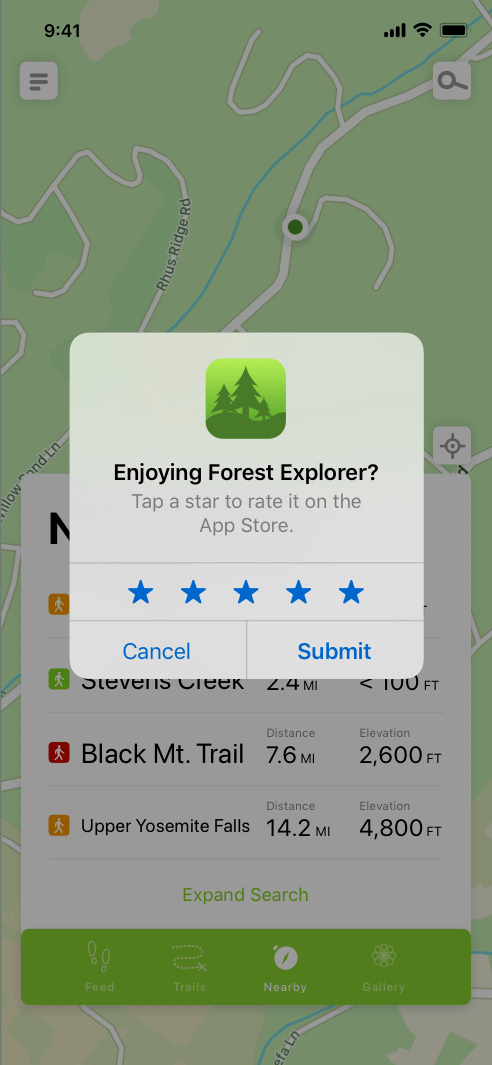
Example of an in-app review.
Positive app reviews are a leading factor in your app’s discoverability in the app stores — and a likely motivator to convince people to try your app. One proven technique to get more and better app reviews is through in-app review experiences. These avoid requiring users to leave the app and visit the app store to give reviews. You can proactively ask for a review at the best possible moment — and increase the chances of getting the review you want vs. the one you don’t. Our Android developers wrote about how to add the in-app review API and improve your Android app rating. This helped our client 3M improve their app reviews by 70 percent.
The hamburger menu — one of the most common app UI conventions — remains at the center of a “juicy” debate among app development teams. Some argue that users are accustomed to this somewhat crude method of navigation. But it’s only because we’ve been trained. Our app designers are fans of obliterating the hamburger menu in favor of a more modern and intuitive tab bar. This surfaces the most useful navigation options without hiding them between buns. If your app still has a hamburger on the menu, there’s nothing happy about this meal.
I probably use my voice to dictate and search within apps more than I type these days — and I’m not alone. Thanks to Siri and Google Assistant, people have become more and more comfortable engaging with their devices through voice. One study found that 52% of people use voice search while driving, and 65% use voice daily to engage with connected devices. If you haven’t added voice support to your app, you’re missing an opportunity to engage with them in the way they prefer more and more.
Apple and Google both have smart watches and connected TV products in their ecosystems. Lovable app experiences go beyond just the phone. For example, Uber has a phone app and a watch experience that is also installed automatically when a user has an Apple Watch. Udemy has a phone app and an Apple TV app so that you can learn both from the comfort of your couch or on the go. Supporting these second- and third-screen experiences often requires only incremental effort, as they use many of the same tools developers are already familiar with. If your app is still phone only, you may be missing opportunities for re-engagement with your customers at other touchpoints.
ArcTouch has built hundreds of lovable apps for Fortune 500 companies and leading brands since the dawn of the App Store. We can help modernize your app to improve customer satisfaction and increase user engagement. Contact us for a free consultation and user experience audit.
