Follow Us


© Copyright 2026 ArcTouch. All rights reserved.
© Copyright 2026 ArcTouch. All rights reserved.
With the recent introduction of iOS 8 and Android Lollipop, motion design and material design are two of seven important 2015 trends in app UI design.
5 min. read - February 24, 2015
Get our newsletter in your inbox.
ArcTouch shares 7 accessibility user testing insights and best practices for apps and websites.
ArcTouch’s design team shares insights on using generative AI to help create mood boards for UI inspiration.
We help companies of all sizes build lovable apps, websites, and connected experiences.
Like clockwork, app UI design advances with each annual update of the iOS and Android platforms. Android Lollipop was a particularly dramatic change in 2014 and iOS 7 in 2013 — though with each new release, the two dominant mobile platforms are becoming more alike than different in their design and in the tools available to app designers.
With summer and fall 2014 releases of Android Lollipop and iOS 8, we’re just now starting to see apps hit the market that take full advantage of the new features. Here are 7 app UI design trends that will shape the mobile experience in 2015.
Motion design has existed for decades, most notably in movie intros, advertisements, and music videos. As UI design in mobile apps has advanced over the past few years, motion design is now being used to delight the user, as a way of rewarding them for their actions. Notice when you swipe a list, that some images can have a slight parallax effect or bounce in an elegant way when you release your finger. Motion design now can also help guide the user through your app. Tapping a toggle button now might morph into the contrasting icon’s form, as shown below with a motion-influenced mute toggle button (source: James Lavine on Dribbble). These subtle movements provide a truly refined app UI design.
Designing for Android can be difficult because of all of the different devices and screen sizes. Now comes iPhone 6, with two new screen sizes to support. Phones, phablets, and tablets of varying sizes and orientations will force designers and developers to move away from pixel-perfect full-image backgrounds — and to make designs more simplified and responsive for both platforms. Designers used to be able to make two icon sizes: standard (1x, mdpi) and retina (@2x, xhdpi). Now with @3x assets for iPhone 6+, we need to look to vector assets that scale to any screen size and density.
Back in 2013, Apple refined its system fonts with iOS 7 — bringing the beauty and mastery of print typography to the digital world. Each letter is kerned and weighted just right to give users the best experience. With Android’s the most recent OS (Lollipop), Google also remastered their Roboto font for the same reasons. On both platforms, these native fonts are fully scalable depending on preference — users can go into their phone settings and adjust the text size to be ‘Large,’ and apps on their phone will adapt to show larger typography within the app. With the growing number of screen sizes, absolute styling for incremental screen sizes is no longer an option — designers must implement more fluid interfaces and scalable typography.
iOS 8 has enabled apps to take advantage of third-party extensions, similar to Android. So, instead of reinventing functionality that already exists in other apps, developers can focus on what makes their app great. For example, your app may need photo editing. To build a feature like this from scratch would take a lot of time and resources. But now apps on both iOS and Android can leverage photo editing functionality via extensions. Services like Instagram and VISCO Cam can foster more widespread use of their features and proven user experience by offering them as extensions to other apps.
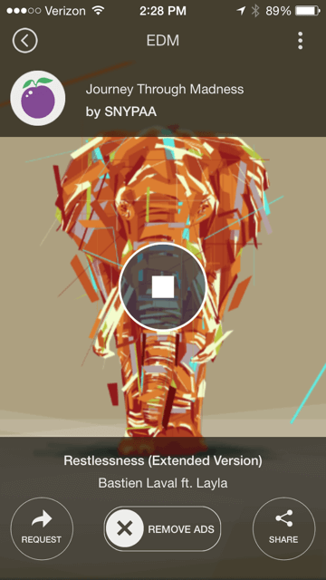
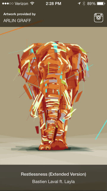
No, we don’t mean that navigation is going away, or is less important. Hidden navigation features — often revealed by a swipe or a touch — give designers a chance to simplify UI so the user can focus on the content. For example, in a media player like the new Plum Radio app (shown below), tap anywhere and you instantly see (below left) the controls you need. But while you are passively listening (below right), those controls fade out of sight. Another trick: We are seeing more apps with tab bars at the top of the screen that hide as you scroll down — but then reappear when you scroll up. Swipe views are becoming more commonplace as well: For example, as you swipe left and right between screens, you can pan through articles on a news reader, eliminating the need to go back to a list of articles.
We used to think of a mobile app as a series of single screen views. Navigating deeper in the flow meant pushing new screens in from the right. Now, you might make a selection on a form and a new group of form elements transition directly into the page. Or, tapping on an action can reveal previously hidden content rather than taking you to an entirely new screen. The user no longer loses context as they move through an app, but is now able to keep a deeper sense of orientation when navigating within a dynamic, single-page app. These two readers from Facebook’s Paper and Timeline, News in Context are great examples:
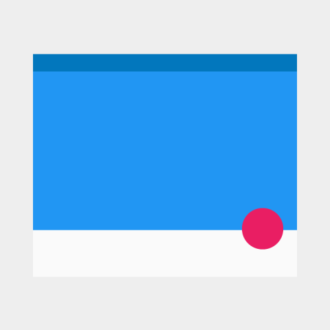
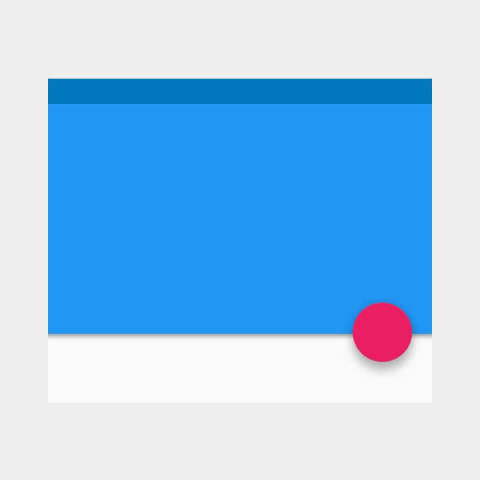
You might think of material design as just an Android thing since Google spent a lot of effort on the subject at last year’s Google I/O. But we expect to see an increasing number of websites and apps on both iOS and Android that will use material design style. Look for an increase in the ripple tap effect on buttons, the floating action button (shown below from Google’s Design Guidelines), layered interfaces with subtle drop shadows to denote layering and behavior, and much more.
Need help designing your next mobile app? ArcTouch offers award-winning mobile app design services, along with engineering and mobile strategy. Let’s talk!
