Follow Us


© Copyright 2026 ArcTouch. All rights reserved.
© Copyright 2026 ArcTouch. All rights reserved.
Working on components in isolation helps our teams move faster, stay aligned, and ship apps that perform great and are lovable at every step
4 min. read - December 17, 2025
Get our newsletter in your inbox.

A comprehensive set of standards, documentation, and reusable components help make the company’s new website more accessible
Low-code, no-code frameworks give app developers efficiency — but also have limitations
We help companies of all sizes build lovable apps, websites, and connected experiences.

At ArcTouch, we’re always looking for ways to build lovable apps faster — without breaking what already works. That’s where component playgrounds come in. By allowing us to build and test UI components in isolation, these tools make it easier to iterate quickly, identify bugs early, and deliver consistent designs without interfering with other parts of the app.
Two tools in particular, Storybook (for React and React Native) and Widgetbook (for Flutter), have become essential to our cross-platform app development workflow. They streamline collaboration across design and development, helping us ship high-quality, cohesive UIs faster than ever.
Component playgrounds, such as Storybook and Widgetbook, allow us to develop and test UI components independently. With these tools, we can work on a button or header without launching the entire app. Each component lives in its own sandbox, where we can preview different states (e.g. dark mode, loading, errors, etc.) instantly.
This component-driven development approach gives our teams and clients major benefits:
Speed: Developers iterate faster without navigating full app flows.
Quality: We catch issues early and test components in every scenario.
Consistency: Everyone references the same living component library.
Collaboration: Designers, developers, and clients can review components interactively and give feedback in real-time.
Once the components are solid, we bring them together in the full app — confident that each piece fits perfectly.
Now that we’ve covered why component playgrounds are so valuable, let’s look at how we use two of the most powerful ones — Storybook and Widgetbook — and the unique benefits each brings to our projects.
Storybook is an open-source tool that acts as a living catalog of UI components. We run it alongside our React and React Native app development projects, giving developers, designers, and stakeholders a shared space to browse and test every component.
Some of our favorite Storybook features:
Interactive controls: Tweak properties, colors, or text on-the-fly to test variations and edge cases.
Built-in testing: App accessibility checks, interaction tests, and visual regression comparisons ensure that every component behaves and looks as expected.
Auto-documentation: Storybook generates usage docs and props tables automatically — making it easier for new developers (or clients’ teams) to reuse components.
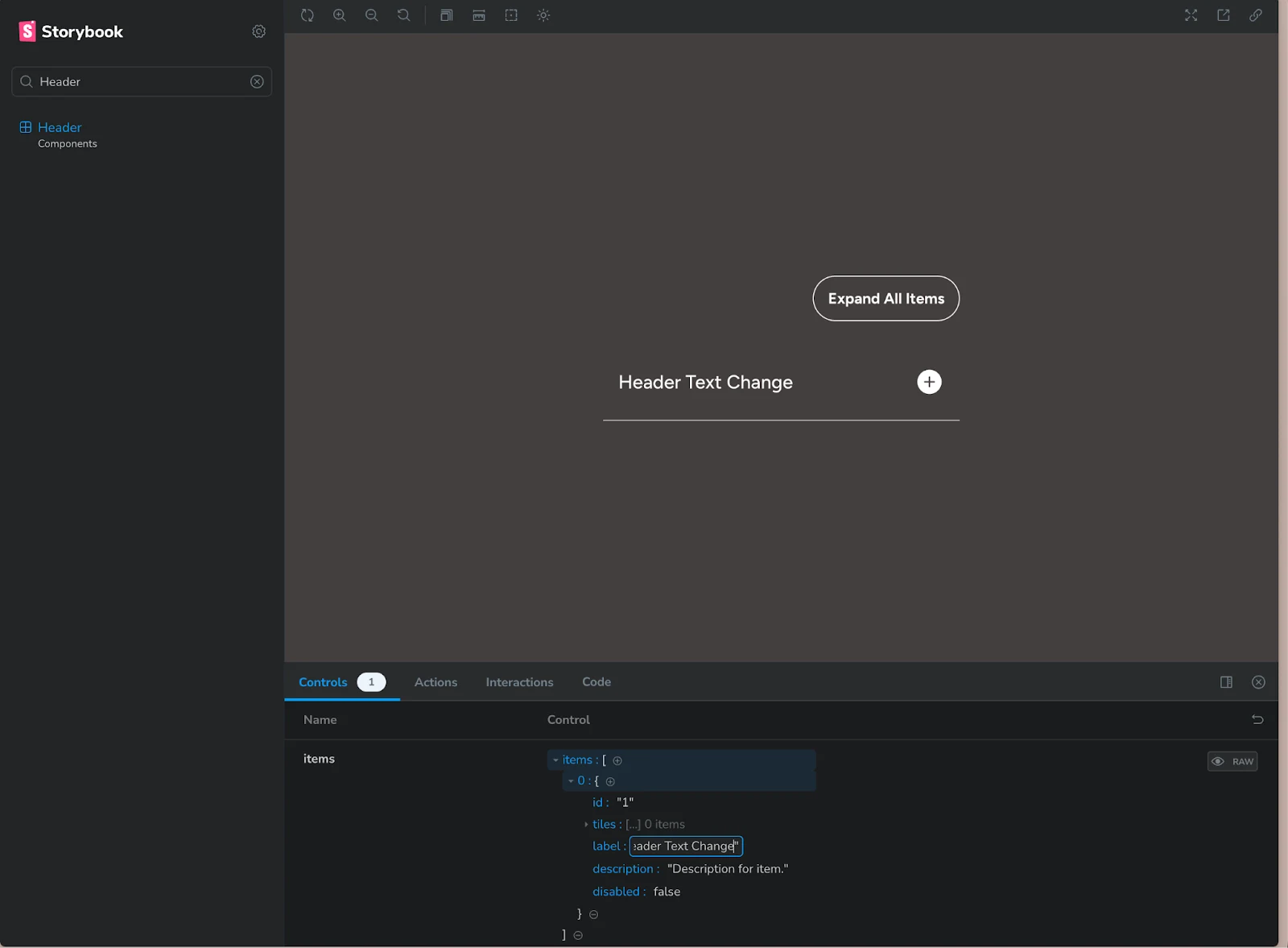
Update a component's header text on-the-fly using Storybook’s interactive controls.
Even our ArcTouch website was built this way — every UI piece was created, tested, and approved in Storybook before it went live.
Storybook also shines in React Native development. Developers can run Storybook in a browser or directly on a device emulator, previewing components without launching the full app.
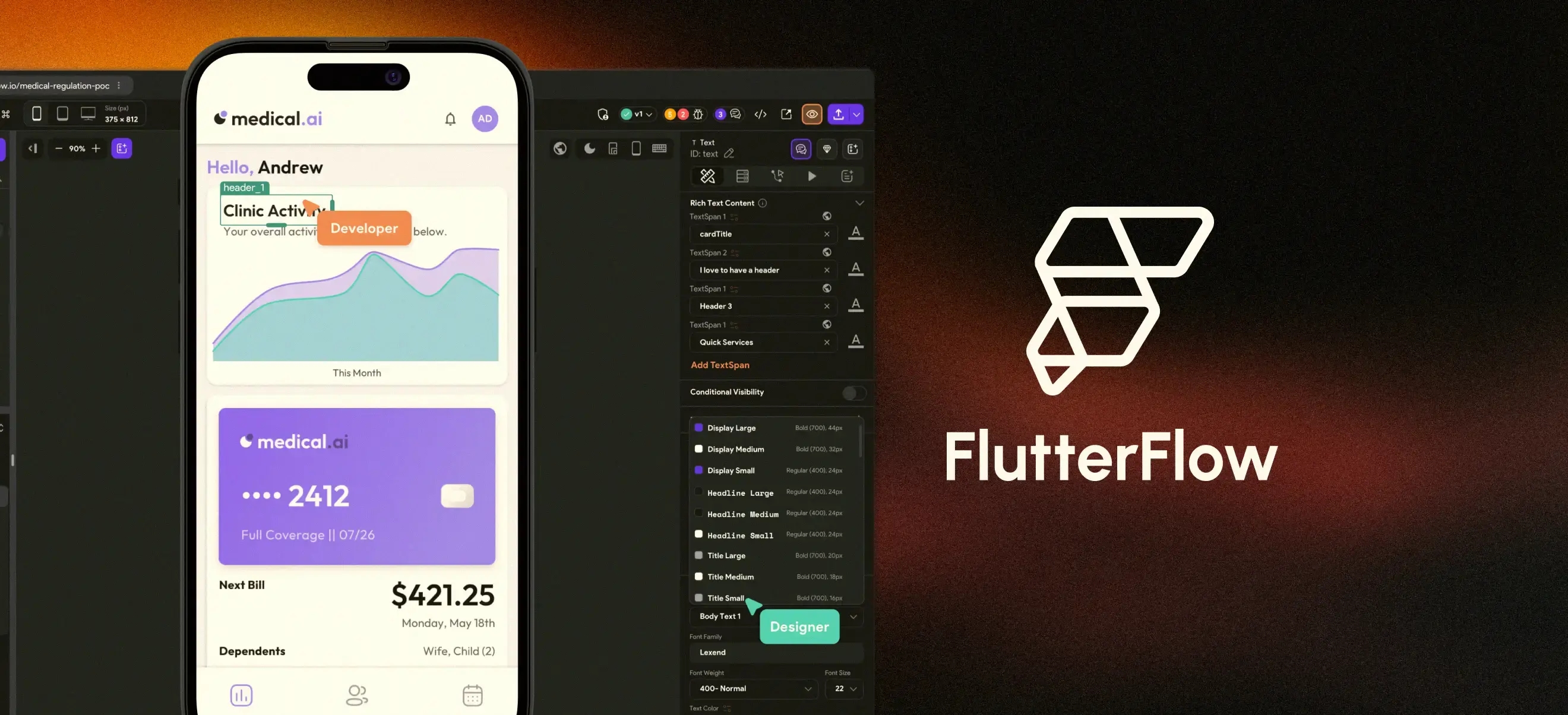
On a recent cross-platform project, our team used Storybook to perfect a custom navigation header with multiple variants — transparent, colored, with and without a user avatar — all before integrating it into production. That isolated workflow meant the component was fully tested, visually consistent, and ready to drop into the live app with confidence.
For Flutter app development, we rely on Widgetbook, a similar open-source tool purpose-built for Flutter. It helps us create “use cases” for widgets — for example, different versions of a ProfileCard component that show how it appears for various user types (e.g., a basic user, a premium user, or one with a long name).
Key advantages:
Mock any state: We can preview complex UI scenarios without depending on live data or deep navigation flows.
Widgetbook Cloud: Adds a review layer — visual diffs for every pull request, where designers and QA can approve UI changes before merging.
Client collaboration: We often share a Widgetbook link so clients can preview components in real time and provide early input.
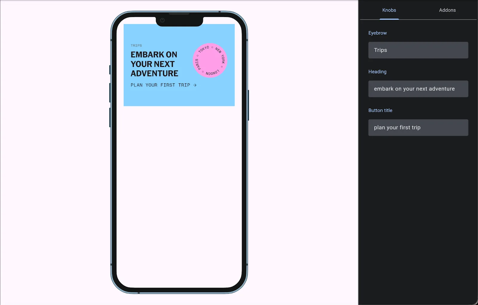
Widgetbook's component preview enables state changes in real time.
This structured workflow keeps everyone aligned — from developers to designers to clients — and ensures that by the time widgets are assembled into full screens, they’re already rock-solid.
In one recent Flutter project, our team used Widgetbook to test alert banner states that were difficult to trigger in the live app. By simulating them directly in Widgetbook, we caught layout issues early and fine-tuned designs long before the full integration phase. That’s exactly the kind of efficiency and quality gain that makes this tool so powerful.
Storybook and Widgetbook aren’t just cool tools — they represent a modern approach to component-driven development. They help us:
Ship features faster by parallelizing work across teams.
Improve UI quality and consistency through early testing.
Strengthen collaboration between ArcTouch, our clients, and their customers.
These tools embody the principles behind our promise to build lovable apps — experiences that are as delightful to develop as they are to use.
As these tools evolve, so will we. But one thing’s for sure: Whether it’s a startup prototype or a Fortune 500 digital solution, Storybook and Widgetbook will continue to help us turn sketches into polished, production-ready apps — one component at a time.
Interested in how our team can help you move faster — without sacrificing quality or design consistency? Contact us to start building your next lovable app.
