Follow Us


© Copyright 2026 ArcTouch. All rights reserved.
© Copyright 2026 ArcTouch. All rights reserved.
Our perspective on what Liquid Glass means for the future of UX/UI design across Apple's ecosystem
9 min. read - July 10, 2025
Get our newsletter in your inbox.

Understand the pros and cons of third-party payment platforms vs. Apple’s in-app purchases

ArcTouch design leaders share best practices for accessible app design, and how they designed the Magellan Rx app for accessibility.
We help companies of all sizes build lovable apps, websites, and connected experiences.
At the recent WWDC 2025, Apple introduced Liquid Glass, a new design concept poised to redefine and unify user interfaces across iOS, macOS, watchOS, iPadOS, and tvOS. This isn't just a visual refresh; it's a fundamental shift in how apps look and feel. For product leaders, designers, and developers, understanding Liquid Glass is crucial. While it might be premature to fully adopt it now, we believe it will eventually become a standard across the Apple ecosystem. This post offers our perspective on what Liquid Glass means for apps today and tomorrow, along with an overview of the technical underpinning.
Apple has a history of shifting interface design paradigms, from the rich textures of skeuomorphism of the original iPhone operating system introduced in 2007, to the clean lines of flat design starting in 2013 with iOS 7. Liquid Glass seems to bridge these worlds, sitting between the "old" materiality and the "new" youthful approach.
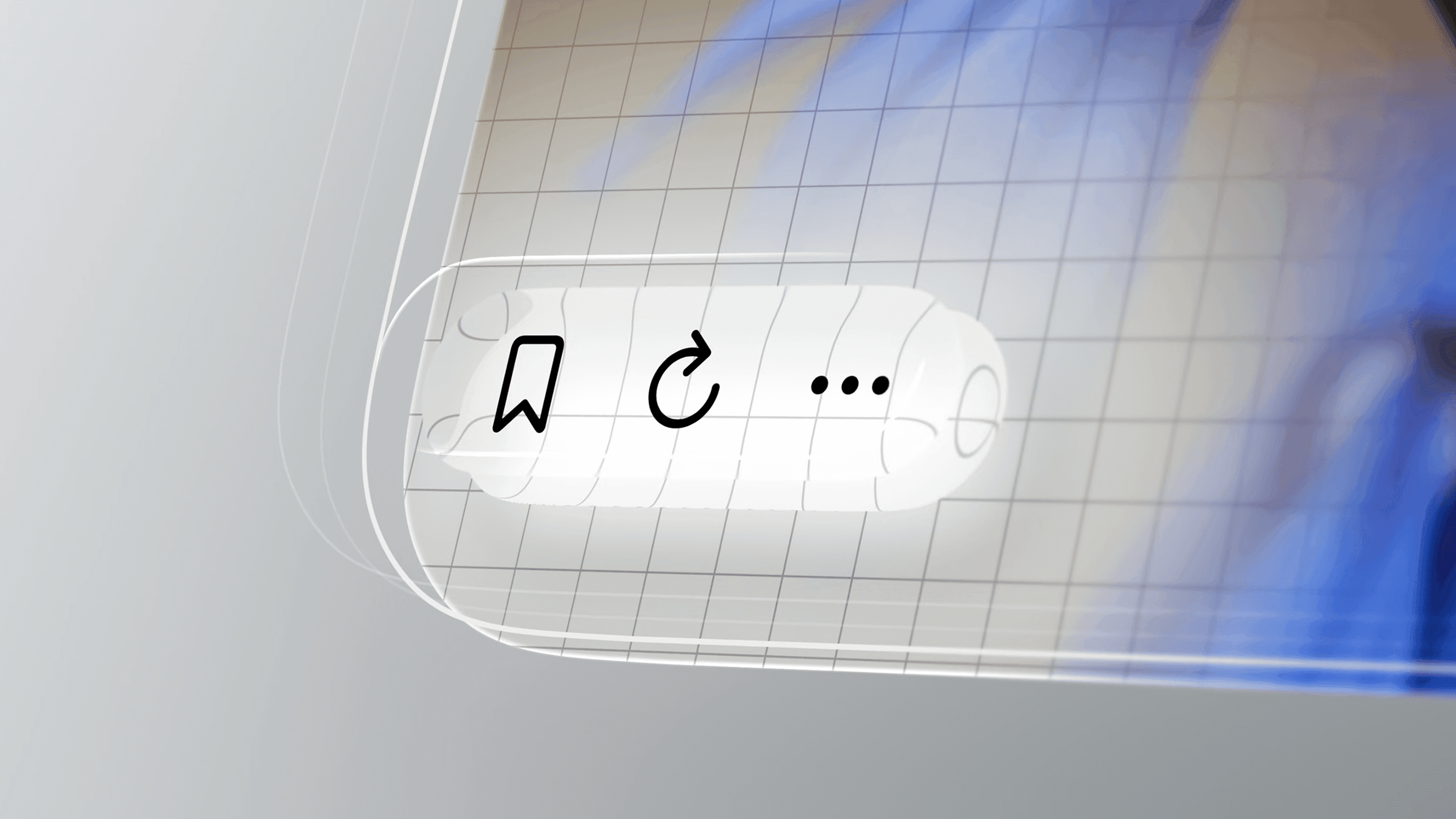
Imagine app elements that behave like real liquid, creating a surface that looks like glass but moves and flows like water. That's Liquid Glass. It dynamically blurs the background and adjusts its colors based on the elements behind it, ensuring proper contrast and avoiding visual issues.
The most striking characteristics include:
Fluid motion: Elements move and flow with lifelike fluidity.
Transparency: A translucent quality that reveals content beneath.
Dynamic blurring: Backgrounds subtly blur to maintain focus.
Adaptive color shifting: Colors adjust based on surrounding elements for harmony.
Smooth transitions: Seamless changes between states and views.
The core philosophy behind Liquid Glass goes beyond just aesthetics. Apple aims to create a consistent, intuitive experience across all its operating systems, regardless of the device. While it ensures content remains clear and visually accessible, it also embodies a broader design principle: creating an interface that feels alive and immersive within the environment.
Liquid Glass isn't just a visual trick; it's built upon sophisticated technical principles along with hardware and software advancements. The power of Apple's M-series chips, combined with recent updates to the Metal framework, allows for the smooth, seamless user interaction that Liquid Glass demands. Without these underlying technologies, the experience likely wouldn't be as fluid or performant.
Beyond its obvious translucency and fluidity, Liquid Glass is defined by:
Dynamic transformation: It adapts in real-time to user interactions (taps, swipes), mimicking liquid behavior while maintaining a polished, glass-like aesthetic.
Context awareness: It intelligently analyzes its surroundings, dynamically adjusting color, opacity, and blur based on content behind or around it. This ensures proper contrast, readability, and visual harmony.
Real-time rendering: Advanced rendering techniques, powered by Apple’s Metal framework, deliver smooth animations and lifelike fluid simulations without compromising performance.
Depth and layering: Through the depth of subtle layering effects, spatial hierarchy helps users intuitively understand interface components.
Minimalism with elegance: While visually dynamic, it adheres to Apple’s core design philosophy of simplicity, enhancing the interface without overwhelming it.
User-centric interaction: Responsive, physics-based behaviors make the interface feel alive and tactile, bridging the gap between digital and physical experiences.
Achieving the optical qualities of Liquid Glass involves leveraging advanced libraries like the Metal framework, Core Animation, and Core Graphics. These technologies enable dynamic rendering and fluid interactions.
Liquid Glass combines the optical qualities of glass with fluidity as it transforms depending on the content or context.
For developers, the immediate impact of Liquid Glass on existing apps varies depending on the framework used:
SwiftUI: Apps built with SwiftUI using standard system components (e.g., NavigationStack, List, Form) have high potential for "free" adoption. Native SwiftUI components will be automatically updated to the new design when users update their devices to iOS 26.
UIKit apps: Some automatic benefits may occur for system-provided views like UINavigationBar or UITabBar if Apple enhances them. However, for custom-designed interfaces, app developers will need to explicitly adopt Liquid Glass by updating your code with new APIs or materials.
AppKit apps: Modern AppKit apps using materials like NSVisualEffectView might see incremental benefits. Legacy macOS apps won't see automatic improvements and will require adopting new material types or rendering APIs.
In summary, SwiftUI apps using standard components will see the most immediate benefits. UIKit and AppKit apps with custom designs will require more effort. While some "free" adoption might happen for existing apps, Apple will likely encourage and probably require adherence to the design concept for new apps.
Developers can explicitly leverage Liquid Glass effects in custom UI elements using new SwiftUI APIs:
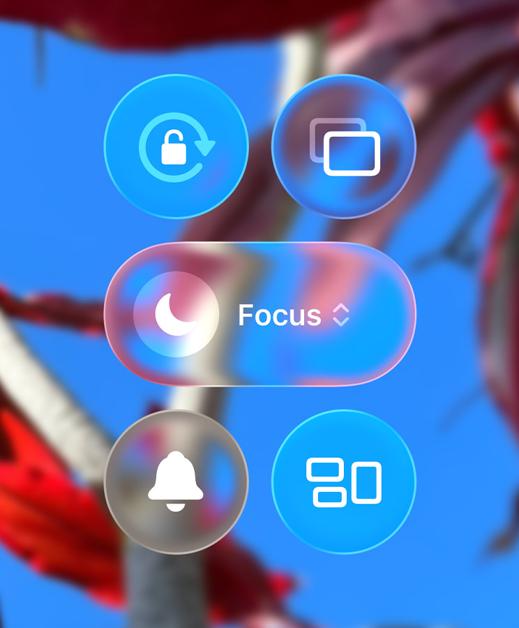
.backgroundExtensionEffect ViewModifier: Applies a blurred mirror effect behind the view, extending beyond the Safe Area to make the screen appear bigger.
.tabBarMinimizeBehavior ViewModifier: Configures TabViews to minimize when scrolled, increasing content area. You can also customize behavior when tab bar placement changes using .tabViewBottomAccessoryPlacement.
Sheets: SwiftUI automatically adds a gradual glass effect to sheet backgrounds based on position. It's recommended not to explicitly add backgrounds to sheets.
.searchable ViewModifier (in NavigationStack): Applies a glassy background to the search bar, appearing on top for iPad/Mac and dynamically moving on iPhone.
ButtonStyles: New .glass and .glassProminent styles apply the glass effect to buttons.
.glassEffect ViewModifier: Adds the new effect to any view. By default, it creates a round background but is customizable with shape and tint color (tint should be for information, not stylization). It also has an interactive parameter for movement, bounce, or shine.
GlassEffectContainer: Use this to make multiple glass elements interact, blending and creating great animations when using .glassEffect and .glassEffectID.
When applying Liquid Glass effects to custom views, here are some tips:
Do: Use as many native components as possible (they have built-in effects). Use strategies to hide elements when not needed (like minimizing the tab bar). Adopt GlassEffectContainer for great interactions.
Don't: Avoid adding background effects to sheets (SwiftUI handles it automatically). Don't add background colors to toolbars (they automatically have a glass effect).
Beyond its visual appeal, Liquid Glass introduces new user experience factors that designers and developers need to consider, particularly concerning accessibility and performance.
New controls on toolbars use a hierarchy divided into groups with icons for correlated actions. While some apps like Safari already use these groups, the new macOS Tahoe UI can feel crowded, combining buttons, tabs, and URL fields with minimal spacing and many group dividers displaying the Liquid Glass effect. This shows Apple's effort to encourage the use of the SF Symbols library and leverage the glass effect across the UI.
Apple now provides its own platform, Icon Composer, for building and testing app icons across various themes. Customization is a big feature on iOS, allowing users to choose how icons appear (e.g., with the Liquid Glass effect or a consistent color palette). Icon Composer helps visualize how these customization options affect your app icon, especially when applying specific brand guidelines or ensuring minimum color contrast for accessibility.
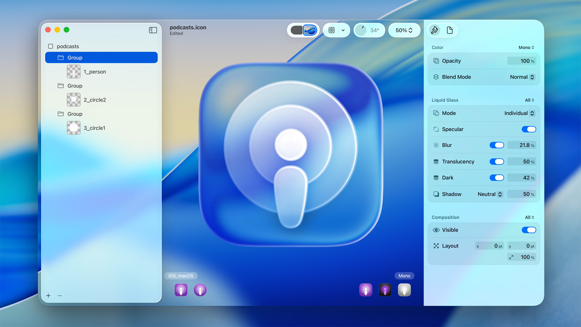
Icon Composer lets developers create Liquid Glass icons across platforms that render in light, dark, tinted, or clear looks.
In terms of layout, Liquid Glass's influence isn't primarily about structural changes. Its greater impact lies in how it's rendered and performed in the code. However, this entire layer of effects adds variables related to contrast, which designers and developers must consider.
Liquid Glass raises important accessibility considerations, which Apple hasn’t provided extensive details about, but continues to iterate on with new releases. Users with low vision may have usability challenges due to the high transparency and translucency. Dynamic blur and refraction, while visually striking, might obscure content or reduce contrast, making text harder to read. Fluid motion and animations could also challenge users sensitive to motion.
Apple's strong track record in accessibility sets high expectations, and it's likely Liquid Glass will address concerns with future updates or details.
Liquid Glass relies heavily on GPU performance for real-time rendering, dynamic blurring, and fluid motion. This can strain older devices, causing lag or increased battery usage. On modern Apple Silicon, it runs efficiently due to optimized hardware and Metal Framework support. Developers should minimize overuse, test across various devices, and provide simpler fallbacks for older hardware to maintain smooth performance.
Liquid Glass represents a significant visual shift, though its novelty is debatable. Critics compare it to older designs like Windows Aero, and the reception has been mixed. From a developer's perspective, implementing this new design across all Apple operating systems is a huge undertaking.
Product leaders should be aware of potential negative feedback. Liquid Glass faces criticism for prioritizing aesthetics over functionality, with concerns about excessive effects, performance on older devices, and accessibility challenges. Addressing these requires balancing design with usability, optimizing performance, respecting accessibility settings, and aligning the value with user needs and business goals.
Not adopting Liquid Glass immediately won't necessarily harm your apps, but it could make them feel outdated over time, especially in design-driven industries. While not a "must-do" update right now, you should prioritize its adoption based on your app's audience, purpose, and competitive landscape. Consider user expectations, business goals, and technical feasibility. If it aligns with your brand and improves engagement without disrupting usability, you should weigh the development effort, performance, and accessibility compliance carefully.
Currently, it’s too soon to fully assess the tangible benefits of adopting Liquid Glass. However, if Apple's claims hold true, it could offer improved visual clarity, a more immersive interface, and enhanced usability through fluid motion and depth.
For cross-platform apps, Liquid Glass poses challenges. Its advanced rendering and hardware optimizations are deeply tied to Apple’s native frameworks. Replicating the fluidity and dynamic effects in non-native platforms (like Flutter) may require significant custom development and could lead to performance trade-offs. Cross-platform ecosystems will likely need 12–18 months to adapt to these changes.
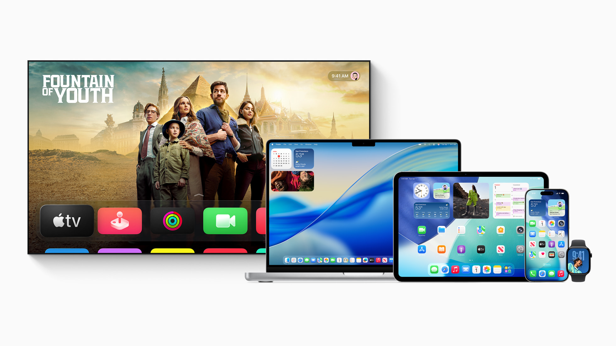
The new design extends across iOS 26, iPadOS 26, macOS Tahoe 26, watchOS 26, and tvOS 26
Liquid Glass reinforces Apple’s ecosystem strategy by creating a consistent, visually cohesive design language across all its operating systems. This uniformity strengthens the seamless user experience, making transitions between devices feel natural. For developers, this means building experiences that look and behave similarly across multiple Apple devices, reducing design fragmentation. However, it also encourages developers to adopt Apple’s native frameworks, reinforcing the ecosystem's appeal.
Apple's Liquid Glass design introduces a new visual paradigm with significant implications for app development. By understanding its core principles, technical underpinnings, and strategic considerations, product leaders, designers, and developers can prepare for its eventual widespread adoption.
Ready to update your apps for Liquid Glass — or simply want some advice from our iOS app developers? ArcTouch has been building apps for Apple products since the dawn of the original App Store. Contact us for a free consultation.
