The New ArcTouch Logo: The World’s Easiest Maze?
You may have noticed we just rolled out our brand new website — and with it, a new ArcTouch logo.
Though we still consider ourselves as nimble, hungry, and tenacious as any young startup, ArcTouch has now been around for six years. With that six years comes time to look back and think about how we’ve changed and who we’ve become.
When we were just getting started, our company name ArcTouch was a practical reflection of what we were: ARChitects of TOUCH-based apps. At the time (shortly after the original iPhone introduction), there weren’t many development firms focused specifically on custom mobile app development, as we were, so our name clearly differentiated us.
Today, you can find hundreds of firms that boast they’re in the business of making apps. But as the industry has evolved, simply building apps isn’t good enough — especially for the kinds of world-class brands and Fortune 500 companies we partner with. The quality of the experiences we can deliver has grown exponentially — both because of advances in hardware and software and our own learnings. With these changes, we’ve evolved. We started as an engineering-centric firm, with the singular goal of producing rock-solid quality apps. Later, we expanded our services into app UX/UI design, and then into digital product strategy, helping companies connect with their employees, partners, and customers in entirely new ways.
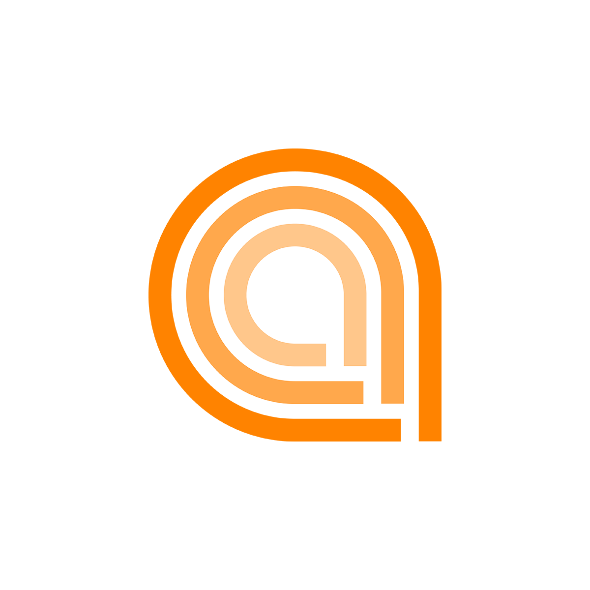
Which brings me to the new logo. Our last logo had a visual arc that stemmed from the “A” and stretched over the logotype ArcTouch. It represented a somewhat linear development process. The new ArcTouch logo has three “a”s that form a fingerprint (staying true to our “touch” based heritage) and signify our three interdependent services: Strategy, Design and Engineering. These three services, like the nested “a”s, fit nicely together in our fluid and agile app development process. You can read more about that process in our new eBook, From Great Idea to Successful Mobile App.
Evolution of the ArcTouch Logo

2008

2009

2014
Another view of the new logo: It looks like the world’s easiest maze. App development isn’t easy, of course, but we’ll guide you through this maze with our expertise — and help you avoid some of the common deadends you might run into without us by your side.
Like many logos, you may not see how all of this matters when you first look at the new ArcTouch logo — but once you get to know us, you’ll understand.
Here’s another small piece from our company lore. Version 1 of our logo was sketched by Eric Shapiro, our Founder and CEO, on a piece of scrap paper before the company was even formed; we certainly went for the MVP of our logo. For Version 2, which came about a month later when we launched the company, we hired a freelancer to design it for $50. For Version 3 (the current version), we partnered with San Francisco firm HDSF, which specializes in brand identity. They spent lots of time with our team learning about what makes ArcTouch unique and distilled this down into our new logo — we think they nailed it!
We hope you like it — and that it is helpful to you to understand who we are and what we do. Take a look at it, starting on our home page, and please comment below to let us know what you think!
ArcTouch.com, 2009 to 2014

2009

2014
